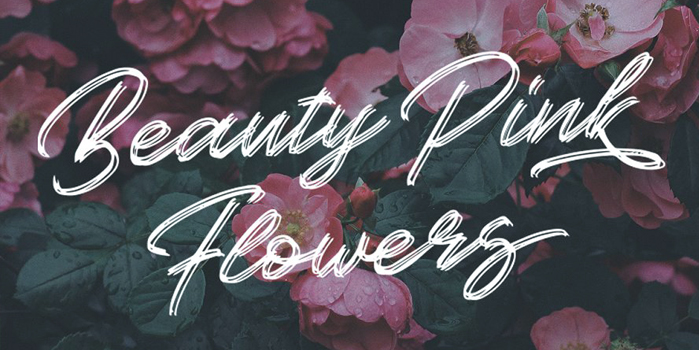
Beautiful fonts, samples. All fonts in Russian language are from ffont.ru.
Tired of boring monotonous fonts? Take a look at this selection, you're sure to find some fonts that won't leave you indifferent. We've gathered the best fonts in different styles so there's plenty to choose from. Also, we indicated on each font whether it supports russian or latin alphabet only. The Cyrillic alphabet this time is more than usual.
We remind you that you can form own collections, by registering on the site. Just downloading is available without registration. If you have problems with installation - read our article «how to install the font», and freely use the fonts in photoshop, illustrator and other programs. So, a fantastic top of fonts to your attention.
Fashionable, elegant
Examples of fonts that would not be ashamed to decorate a store sign or the front of a business card of some jewelry shop. There are more refined representatives, there are more extravagant ones.
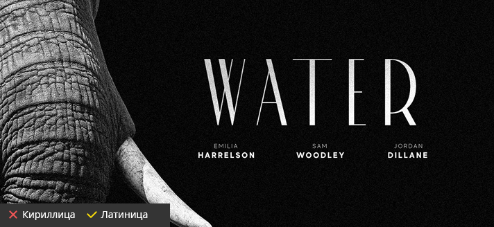
Made Cannes
Beautiful, branded font, perfect for the fashion industry. Only capital letters and nothing superfluous in the design. MadeType is the manufacturer. Intended for personal use.
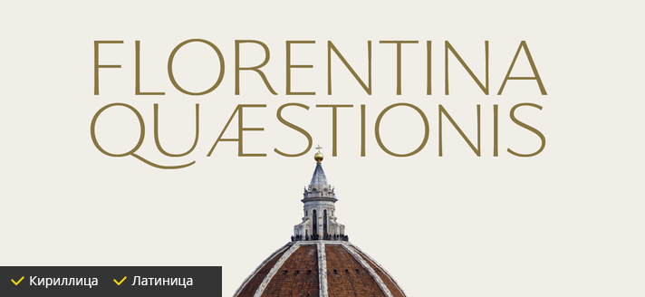
Florentia
Again beautiful capital letters, but with the support of the Cyrillic alphabet. Florentia is a thin font for both headings and normal text. It's very similar to the Roman capital font. It was designed by Francesco Canovaro.
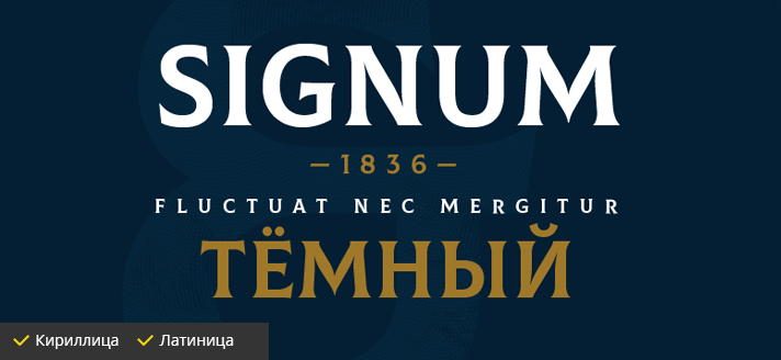
Colus
It's a controversial font, and so is the category it belongs to. But there is something appealing and unusual about it. This font is great for example in the design of alcoholic beverages. The developer is Fontfabric.
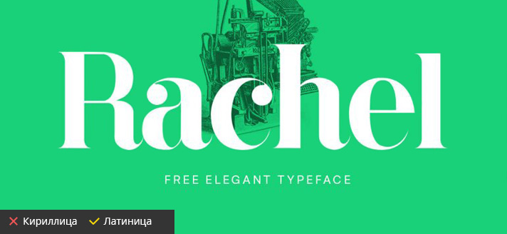
Rachel
Interesting brand font with serifs. You probably saw this font on magazine covers and concert posters more than once. Designed by Danilo De Marco in 2015.
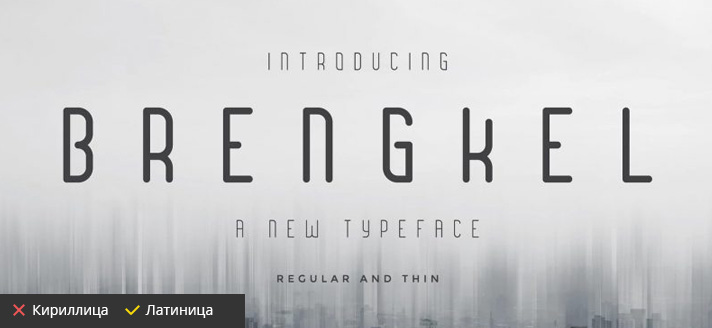
Brengkel
Another stylish, header font. Suitable for logos, cover pages, invitations and more. In some places the letters seem to be incomplete. This gives the typeface a spiciness, but does not impair the readability in any way. The font is designed by MuSan.
Imitation Brush
These fonts will come in handy when decorating various invitations, branding flower stores. We picked up different techniques for all tastes. Unfortunately, there are not many handwritten fonts that support the Russian alphabet.
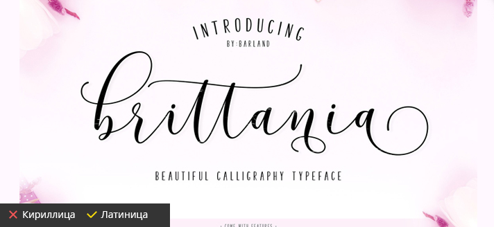
Brittania
It is a fancy font with curly strokes. A wedding invitation using this font will look very attractive. Font designer Barmawy Muchtar.
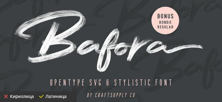
Bafora
This sprawling lettering will allow the imitation of a brush as realistically as possible. The designer has really tried his best at detail. It is not recommended for use on small media, because the details will blend together and the effect will not be the same. The creator of Craft Supply.
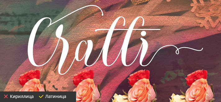
Cratti Script
In some places not legible, but a very good font. Will be suitable for an identity of any direction. Developed by a man under the pseudonym Fadhil.
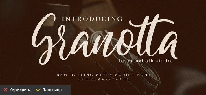
Granotta Script
Grenade in font design. Well-measured letters are quite successfully connected to each other and do not merge into mush like some brethren. The headset manufacturer is Gameboth Studio.
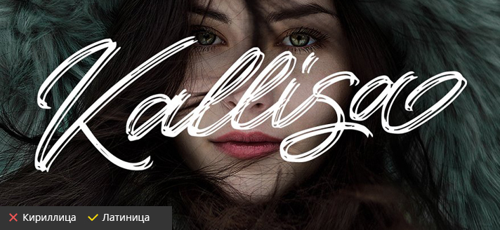
Kallisa
Fresh and seasoned work of the artist. A great find for those who like to use a calligraphic font in a corporate style. Kudos to the developer Blankids Studio.
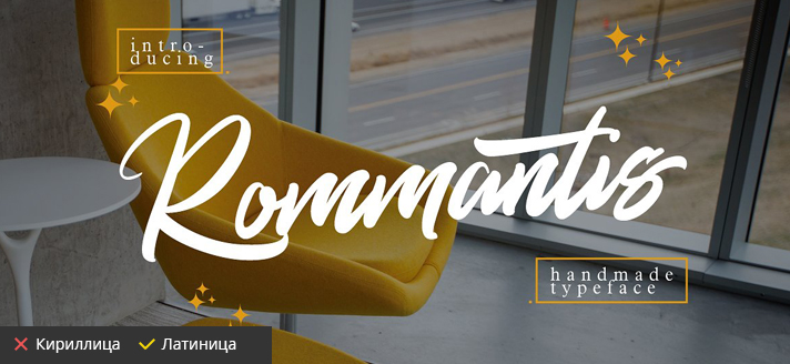
Rommantis
A great, free style of writing. You can safely use it to create lettering. The appeal of this font inspires you to pick up your pen and remember art school. The creation belongs to one Thirtypath.
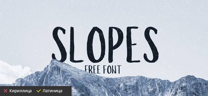
Slopes Brush
For those who value not the number of monograms and flourishes but the readability, usability and scalability. Yes, when reduced the letters of this font will be as distinguishable as at a distance. That is why similar fonts are used in the design of menus and facades in eateries, bars and bakeries. It is a pity that the person named Boris Garic, did not include the Cyrillic script in such a beautiful and useful font.
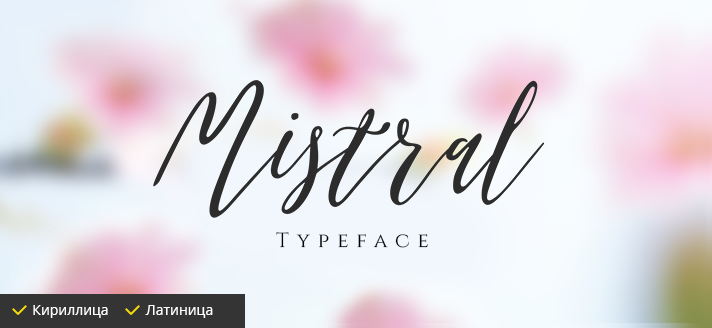
Mistral
And here is the paid analogue. This new font deserves attention already because it's one of the few handwritten fonts that supports Russian. Mistral can easily become part of a stylish branding. But there are some limitations. We do not recommend to use this font for writing large texts. Designer Roman Poliishchuk.
Grotesques
A quality typeface is a guarantee that a great amount of text will be readable. Do not neglect this rule and you will always be understood by the reader. Proper kerning, harmonious proportions, high contrast and flexible scalability.
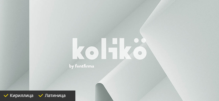
Koliko
A very original and neat font. Includes four fonts, supports Russian glyphs. It's not hard to guess about the scope of this headset, because the name "koliko" already looks like a brand.
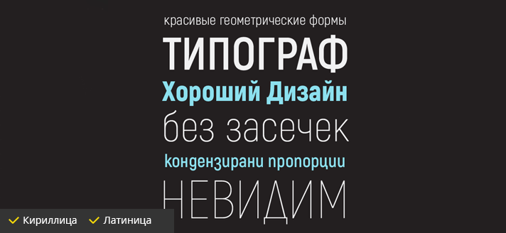
Acrobat
An excellent sans serif font. This family includes eight styles, which is a weighty set for solving various typographic problems. A direct competitor to Roboto, which, in its turn, has become quite familiar. The font is by Fontfabric.
- Download Acrobat Thin font
- Download font Acrobat Extra Light
- Download Acrobat Light font
- Download Acrobat Regular font
- Download Acrobat Semibold font
- Download Acrobat Bold font
- Download Acrobat Extra Bold font
- Download the Acrobat Black font.
Uni Neue
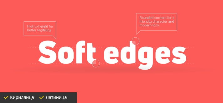
A laconic and interesting font with rounded outlines. As practice shows, uni sans has no analogues in its class. Unfortunately there are only two fonts available for free. The creator of the family is the Fonfabric team.
Geometric, Branded
You can't ignore the contrasting, chopped-up fonts. Poster art would not be so vibrant without the representatives of this trend. Some of them are great as an element of the logo, the rest are indispensable in the headings of websites and product catalogs.
Bebas
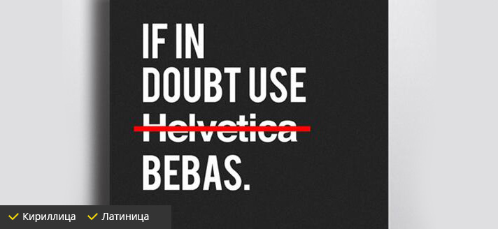
A compact and ergonomic font that has managed to become a classic in domestic typography. Where other grotesque fonts fail, Bebas solves any problem, demonstrating wonders of versatility. The creator of the font is Ryoichi Tsunekawa.
- Download Bebas Light font
- Download Bebas Regular font
- Download Bebas Book font.
- Download Bebas Bold font.
Geometrica Sans
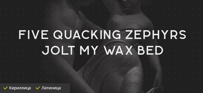
A font that is not ashamed to be used in a corporate style. Rarely can you find a font with such a regularity of geometric forms. In spite of this fact, it is recommended to use with care the capital letters of this shape. They are not as good as capitals. The font was designed by Boris Garic, who is already known to us.
Myra Sans
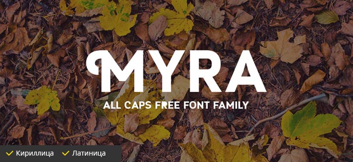
Myra has managed to become a headline classic among free fonts. The family combines the correctness of forms and neat accents, which will not allow you to confuse it with other headsets. The font's developer is Fontfabric.
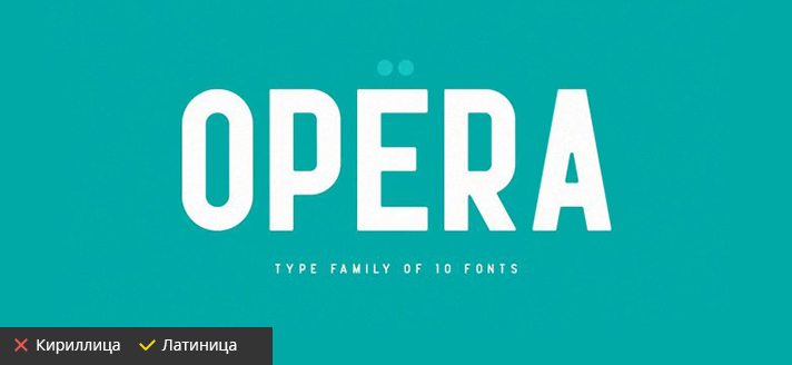
Opera
An unobtrusive, modern, straightforward font. Does not stand out any features, but does not give ground for criticism. A standard, considered solution. Designer Wahyu Rahmawan.
Kids
There is a tangible lack of quality in the niche of children's fonts, especially in Cyrillic. We have selected the best of those that are available for free download and use in commercial projects. Beautiful children's fonts will be indispensable for the design of books, brochures, photo albums.
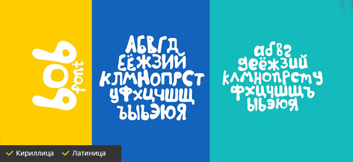
Bob
Remember the Yeralash logo, which is hopelessly outdated. It has been replaced by the fun and funny Bob. We don't know who breathed life into this wonderful font. Perhaps you can tell us?
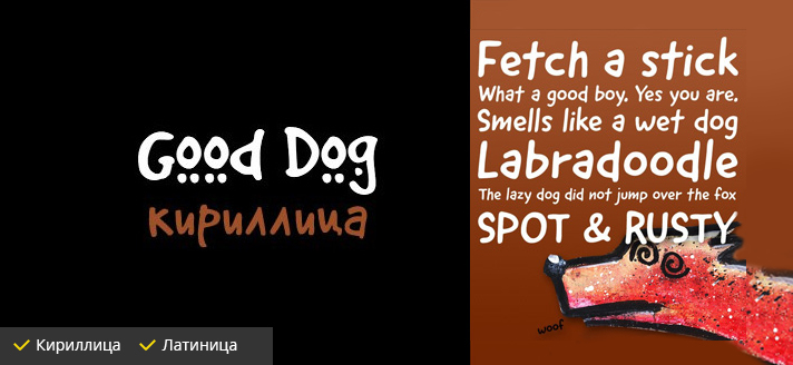
Good dog
An equally fun, but more understated font. One of the oldest and proven over the years. Developer Ethan Dunham.
Made Barista
The name of this font alludes to the fact that its creators wished to see it in coffee houses and snack bars. But that was not the case. The naivety of the font attracted the attention of children's illustrators, who began to use it in their work everywhere. It was brought to life by the infamous Made Type.
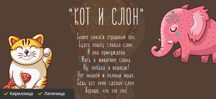
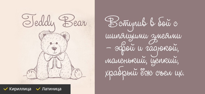
TeddyBear
Lace font for girls. That's how it was described by one of the designers who put together this collection. The font is surprisingly swirly and at the same time legible. Thanks to the designer Ken Barber.
Handwritten
Every designer should have at least several fonts imitating handwriting or brush writing. What a pity there are so few of them and they are so often repeated in designers' works that they have become rather familiar.
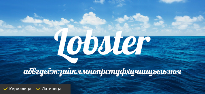
Lobster
Beloved and unique Lobster. For a long time it had no equal among free fonts. Compact, beautiful, readable, it brought real fame to a designer named Pablo Impallari.
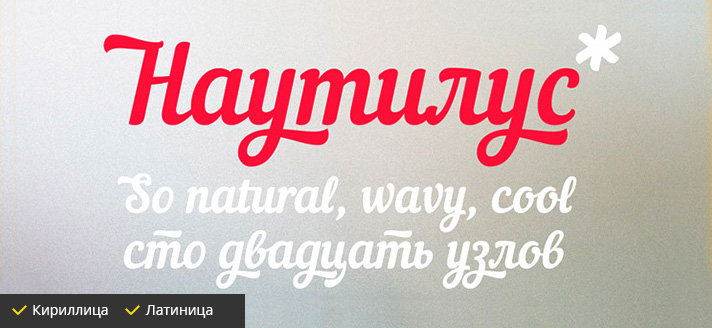
Nautilus Pompilius
Lobster's most important competitor. A font with a soft contrast is really good and would be good for typing posters, headlines, posters, and yes anything else. It even has its own website, type in a search engine, it's interesting there.
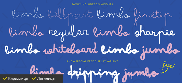
Bimbo Script
Weak in terms of versatility, but interesting in style and naturalness. Fonts with imitation handwriting are also needed, and this is an interesting one. Developer Francesco Canovaro.
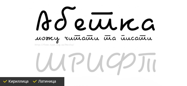
Pecita
Funny and cute font with character. The letters are not connected to each other, but that doesn't make the font fractional or disjointed. Kudos to Philippe Cochy for this beautiful work.
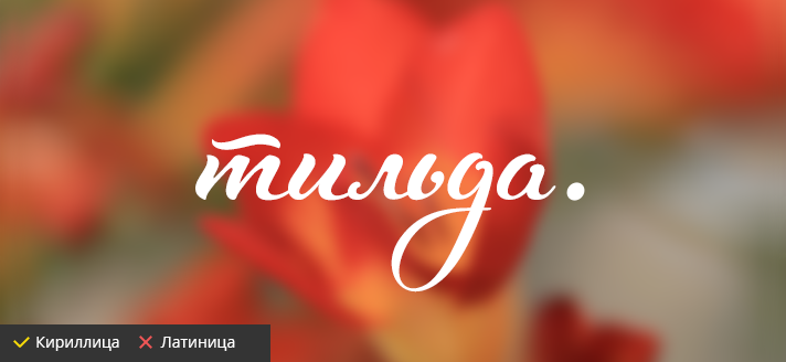
Tilda
Tilda is a fresh, modern, handwritten font that has been popular since day one. Yes, this is one rare paid font in our selection. The typeface has become famous for its alternative glyphs that can diversify typography and make it really unique.
Soft and rounded.
It often happens that the name, or scope of the company, pushes the designer to use flowing lines and rounded shapes. In that case, the following fonts can help you.
Brotherhood
A good example for the coffee theme. Playful and clear letters can help transform a boring menu and decorate a greeting card. The font maker is one Jamaludin.
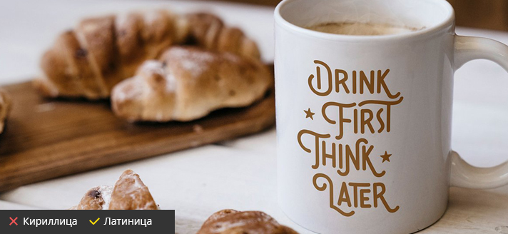
Ossem
A quality, round, sans serif font. One lettering has a decorative addition in the form of small dots. The font was created by Alexander Nedelev and Kiril Semkov.
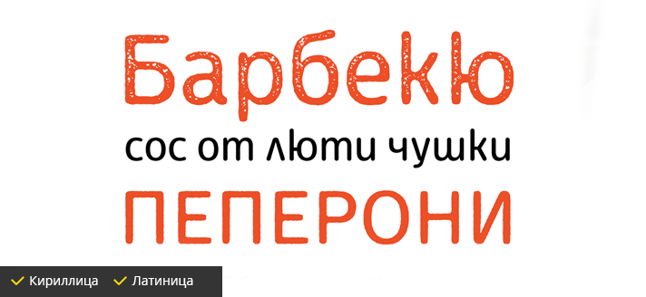
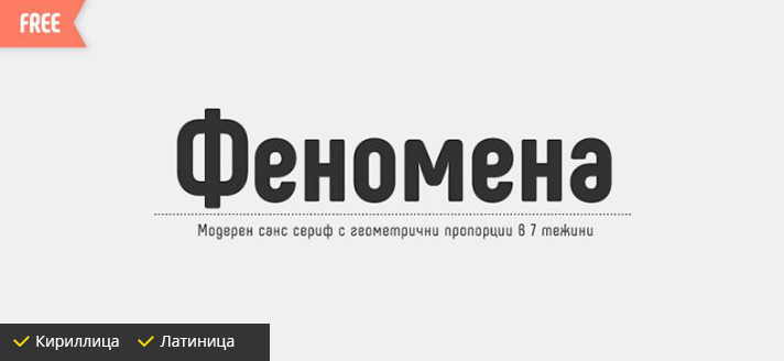
Phenomena
A phenomenal combination of harmony and simplicity. Critics of this font literally have nothing to hold on to, so smooth on all sides. The family includes seven fonts. Thanks to the folks at Fontfabric for their hard work.
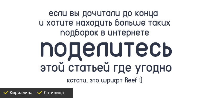
Reff
The cherry on the cake is the most unusual, in some places obscure, but at the same time very charming font. In general, it has everything that can catch the viewer's attention. The creators of this marvelous creation are RIT Creative.
Which font to choose
This question was asked more than once by every designer. And he probably also thought: isn't there such a theory, where a detailed instruction was given, which font in which case would look "on the fife", and with which it is better not to mess with!
But the good thing about design is that such instructions are impossible. It is not subject to strict rules, otherwise it would not be design. There are no typical fonts for "boys" and "girls", there are no variants used exclusively in automotive subjects or advertising of baby formula. There are only some relative rules applied to design, but that, as they say, is another story.
Share this article on social networks if you want to see more such picks. Ask questions and get answers. Good luck to all of you!


