In recent years, hundreds of excellent, new Cyrillic fonts. We have selected ten most used and attractive Russian fonts lately.
Take advantage of the opportunity to create its font collection. This free feature allows you to manage your own collections and keep your favorite fonts at your fingertips at all times.
Which font is better? Which fonts are better to use? That depends on the task at hand.
1. Arkhip
2. Boucle
3. Cabana
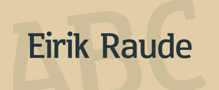
4. Eirik Raude
5. Gogoia
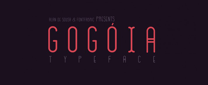
Download Gogoia Deco font.
Download Gogoia Regular font.
6. Muller

Download Muller Thin font
Download Muller Extra Bold font
7. Nexa Script
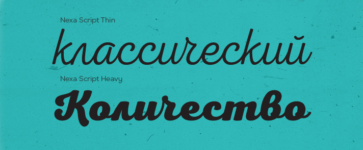
Download Nexa Script Thin font
Download Nexa Script SemiBold font
Download Nexa Script Light
Download Nexa Script Regular fontr
Download Nexa Script Bold font
Download Nexa Script Heavy font
8. Nickainley
9. Dewberry

Download Dewberry Regular font.
Download Dewberry Bold font
Download Dewberry Italic font.
Download Dewberry Bold Italic font
10. Pobeda
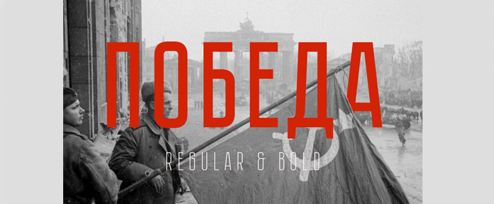
Download Pobeda Bold font
Download Pobeda Regular font
Do not ignore the paid fonts. As a rule, they are more elaborate than their free counterparts, and contain a broader set of characters.
11. Tesla
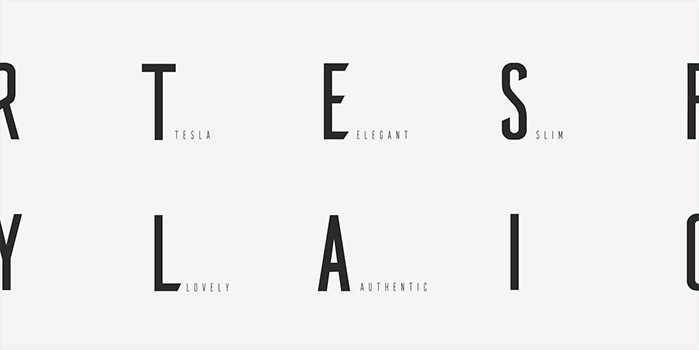
11. Tilda

Unfortunately, there are not as many quality Cyrillic fonts as we would like. But there is undoubtedly a positive trend in their growth. More and more local designers are working on the russification of Western popular fonts, as well as give life to their own, no less qualitative products.
As for use. There are no universal fonts for every task. A font that looks great on paper can look awful as the main typeface on a website. That's why the variety of fonts today is so great, and each of them has its own purpose. For example, an accent font should not be used for solid and small text, nor should chopped fonts be used on websites. In both cases, the perception and readability of the text will be severely impaired. For example, the best font for text on the site - Open Sans. Readable and familiar to the eye font for working with documents Times New Roman.
Beginning designers often wonder "what are the best fonts for logos." The answer is simple: readable. If you're designing a corporate logo - don't try to give the writing any particular artwork or style. For example, don't look for a font with any spikes on the letters if you're making a logo for a flower store. It will be enough to appeal to associations (delicate, subtle, graceful, yet contrasting enough to stand up to scalability).
In most cases, the choice of font for the logo should be based on the advisability of using a particular typeface within a single compositional solution. For example, if the sign is on the left side of the typeface, and the name is long enough, a narrow font with a small kerning is likely to be appropriate. If the word is short, on the contrary, you can make the kerning more and choose a more expressive font.
Generally, there are no rules of font selection. It is necessary to feel it, and make adequate decisions. For example, if it's a medical subject - both antique and grotesque would be fine. It is unlikely that the chopped ones will do. If it's a sports theme - most likely a dynamic, slanted font without any serifs. Probably a relaxed glyph.
Of course, it's best to make the font layout of the logo unique. This will add originality to the logo and credibility for you in the eyes of your colleagues and your client.



.jpg)
